Mozhgan Yaghoobian

SCROLL

Project Overview

This project focuses on shaping a clear and cohesive brand identity for Mozhgan Yaghoobian, grounded in a well-defined archetypal framework. Through strategic positioning, visual language, and symbolic design, the brand was developed to feel authentic, emotionally grounded, and trustworthy. The result is a personal brand that reflects Mozhgan’s values, supports a calm and informed approach to health, and builds meaningful connections with her audience across all touchpoints.

  • Partners

    Bahram Rameh, ,Behnam Rad , Negin Moghaddar Doust

  • Client

    Mozhgan Yaghoobian

  • Published​

    2025

Branding

1. Brand Essence & Philosophy

At the core of Mozhgan Yaghoobian’s brand, nutrition is not treated as a rigid set of rules, but as a human-centered path back to balance.

The brand is built on three foundational archetypes: Innocence (purity and simplicity), Caregiver (supportive guidance and compassion), and Sage (science-based knowledge and transparency).

The intention is to move away from fear-driven narratives, extreme diets, and one-size-fits-all solutions.

Instead, the brand offers a calm, trustworthy experience where clients feel understood, supported, and informed.

Nutrition here becomes a tool for restoring balance, reducing stress, and building a sustainable relationship with the body.

2. Logo Concept & Symbolism

Mozhgan Yaghoobian’s logo is built around an organic, human-centered form that represents growth, balance, and awareness. The structure blends natural elements with a human silhouette, portraying the body as a living system shaped through care, nourishment, and time. Within the form itself, the initials M and Y are subtly integrated into the body of the logo. Rather than appearing as an explicit monogram, these letters are woven into the flow of the design, creating a presence that is felt intuitively rather than immediately recognized. Soft, flowing lines reinforce a sense of calm, trust, and support, intentionally avoiding rigidity or visual dominance. The gentle green palette further emphasizes sustainability, nature, and a non-aggressive approach to health. This logo is not designed to demand attention. It is designed to quietly affirm identity and build trust.

3. Logo System: A Responsive Framework

To ensure clarity, consistency, and adaptability across all brand touchpoints, the logo was designed as a responsive system rather than a single fixed mark.

The system is built around two color applications and two structural layouts, allowing the identity to function seamlessly across digital and physical environments.

Structural Variations

  • Vertical (Square) Layout:

    A compact, centered configuration where the symbol and typography are stacked.

    This version is ideal for social media avatars, packaging labels, profile images, and applications with limited horizontal space.

  • Horizontal (Rectangular) Layout:

    A wide format where the symbol and typography are placed side by side.

    Designed for website headers, printed materials, presentations, and environments that require stronger legibility at a glance.

Color Variations

  • Primary Color Version:

    The full-color logo uses the brand’s signature green to convey calmness, balance, and a natural approach to health and nutrition.

  • Dark Monochrome Version:

    A simplified, single-color application designed for high-contrast situations, technical printing, and environments where color use is limited or unavailable.

Together, these variations form a flexible logo system that maintains visual integrity while adapting to different formats, scales, and contexts.

4. Color Palette & Mood

The color palette is built around a clear hierarchy that reflects balance, calmness, and trust.

At the core of the system are two primary green tones, supported by complementary colors used selectively across the brand.

Primary Greens

The top row represents the brand’s core colors:

  • Light Green: Symbolizing growth, renewal, and a gentle approach to health.

  • Dark Green: Representing stability, depth, and professional credibility.

These two tones form the visual foundation of the brand and should dominate primary applications such as the logo, key visuals, and main interface elements.

Supporting Colors

The remaining colors function as complementary accents, designed to support the primary greens without competing with them.

They are used to create contrast, hierarchy, and clarity in secondary elements, backgrounds, highlights, and functional details.

Together, this palette creates a calm, organic, and balanced visual language that feels natural, trustworthy, and sustainable.

5. Visual Texture & Pattern

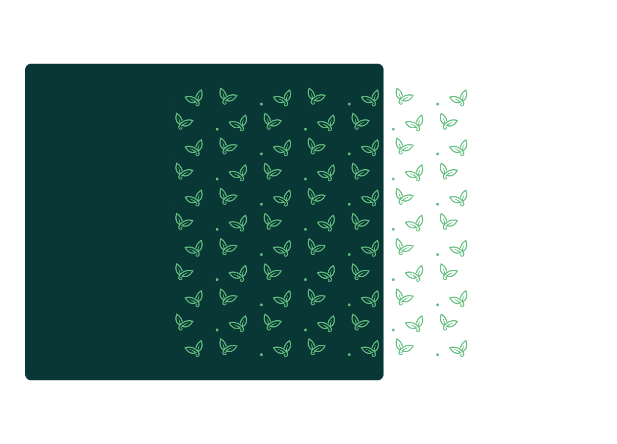
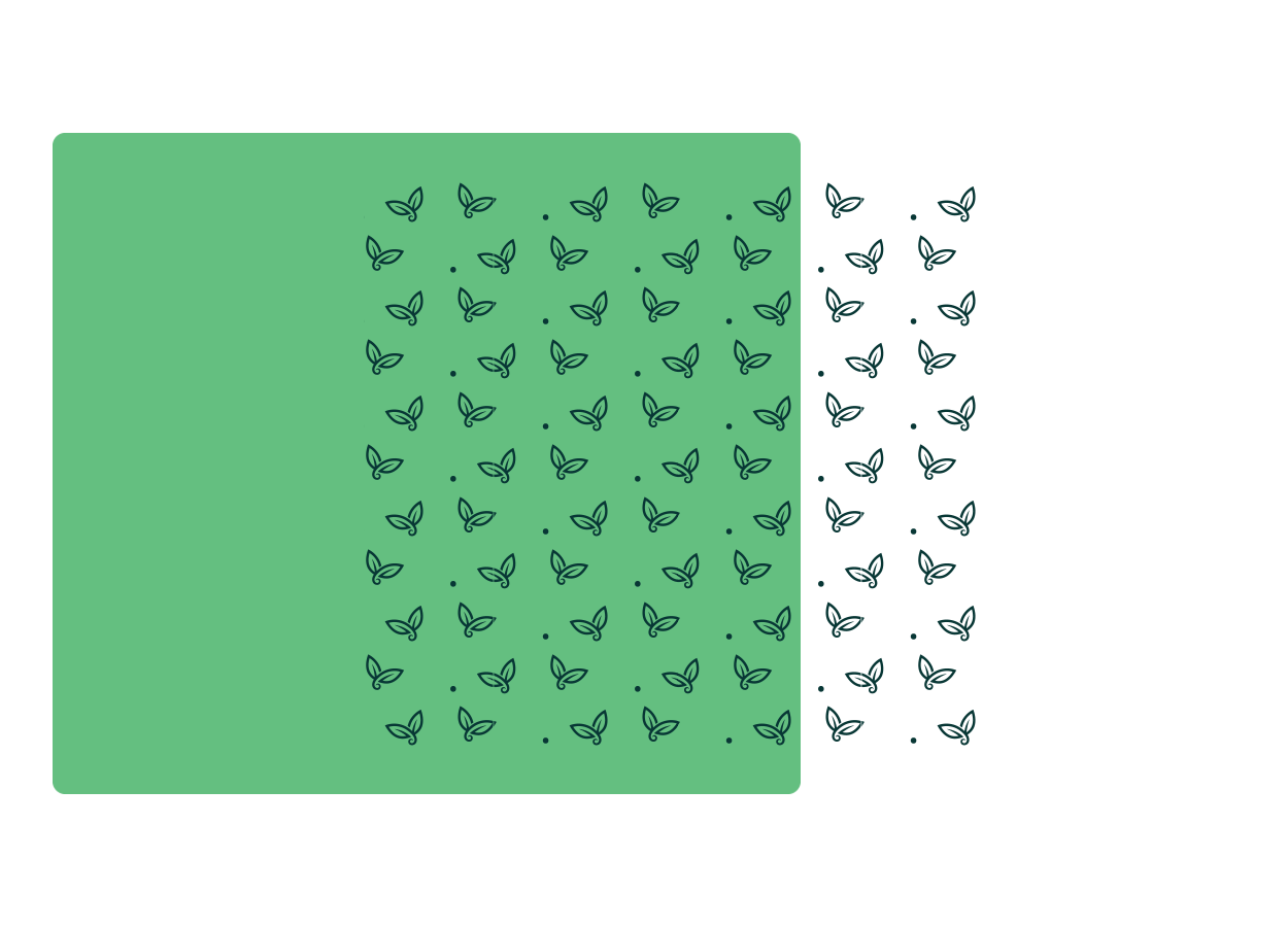
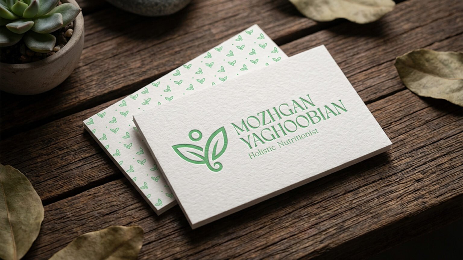
The visual patterns are designed as a subtle extension of the brand’s core identity rather than as standalone decorative elements.

They carry an organic and calm character that reinforces the brand’s human-centered approach.

Inspired by the logo’s soft lines and structural forms, the patterns reflect ideas of growth, continuity, and natural rhythm.

Their repetition is intentionally light and breathable, adding visual texture without distracting from clarity or content.

Applied selectively across backgrounds, digital surfaces, packaging, and secondary brand materials, the patterns help create visual cohesion while remaining supportive rather than dominant.
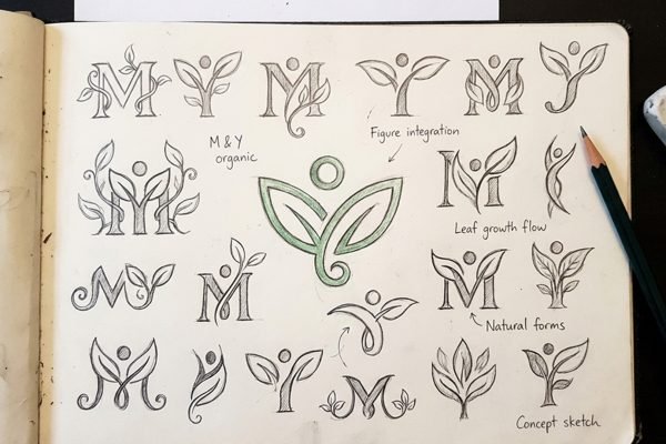
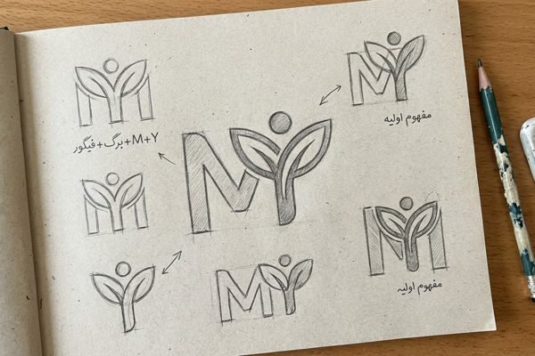
Social Media Visual Identity

The visual identity designed for social media is one of the brand’s most important customer touchpoints.

In this project, posts, stories, and promotional content were designed to ensure instant brand recognition, convey warmth and trust, and create a cohesive digital brand experience.

This visual system turns every online interaction into an opportunity to strengthen brand perception and long-term memorability.

FOLLOW US
Dark
Light