You already are a brand. This form simply helps us see it more clearly — to uncover your core archetype and align your voice, values, and presence with it.
Partners
Bahram Rameh, Shokoufeh Shafieekhah.
Client
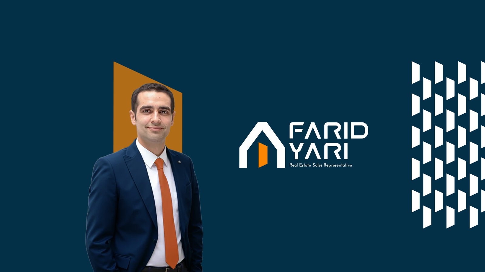
Farid Yari
Published
2025
Branding
1. Brand Essence & Philosophy
Farid Yari’s brand is built around trust, security, and genuine support.
In redefining this identity, the primary focus was to create a balance between a human, approachable presence and a professional, structured authority.
The brand is shaped through a blend of three core archetypes:
Caregiver, representing attentive guidance and responsibility throughout the client’s journey,
Ruler, establishing stability, control, and confidence in one of life’s most important decisions,
and Sage, providing clarity, transparency, and informed insight to support sound decision-making.
The goal was to move away from a cold, purely transactional perception of the real estate market and instead build an identity where clients feel heard, reassured, and supported.
In this approach, buying or selling a property is not a stressful process, but a guided, clear, and trustworthy experience.
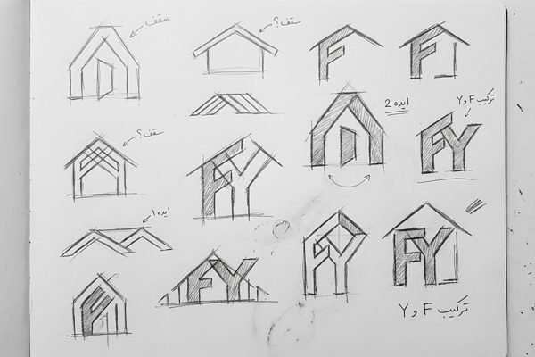
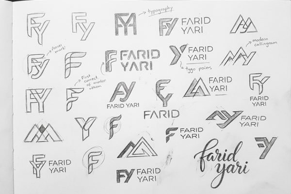
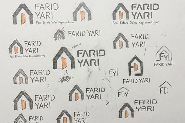
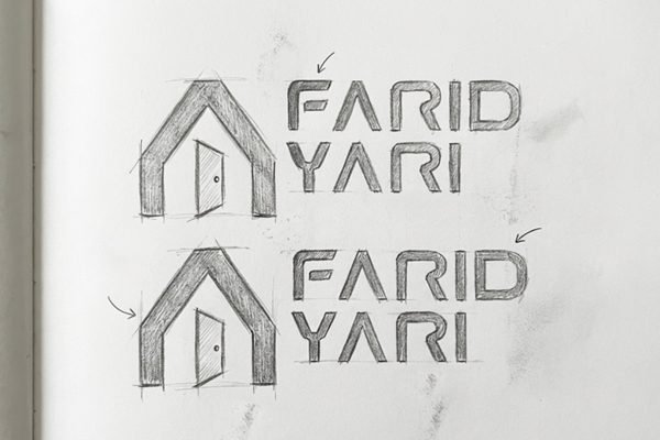
2. Logo Concept & Symbolism
Farid Yari’s logo is built around the core ideas of home, security, and informed decision-making.
The primary form represents a simplified, modern interpretation of a house, designed to convey stability and trust.
The inner element, shaped as a partially open door, symbolizes opportunity, new beginnings, and transparency throughout the decision-making process.
It reflects a sense of invitation, accessibility, and guidance in both buying and selling journeys.
Bold, geometric lines express structure, clarity, and professional authority, while the overall simplicity keeps the logo approachable and free from unnecessary complexity.
This balance mirrors the brand’s philosophy: confident yet non-intrusive.
The logo is designed to remain clear, distinctive, and functional across various scales and applications, from digital icons to printed materials.
4. Color Palette & Mood: A Recipe of Tones
Our palette is carefully curated to trigger appetite and evoke comfort, moving away from artificial colors to an organic, earthy selection:
Terracotta & Sage: The primary duo. The reddish-brown (Terracotta) represents the heat of the oven and authentic spices, while the muted green (Sage) symbolizes fresh herbs and healthy ingredients.
Butter & Dough (Neutrals): Instead of using a single flat white, we utilized a gradient of warm neutrals—ranging from Vanilla to Wheat. These shades mimic the color of fresh dough and bread, reinforcing the “homemade” promise.
Charcoal Black: Used for text and outlines to add modern contrast and professional solidity (The Ruler archetype) without being overpowering.
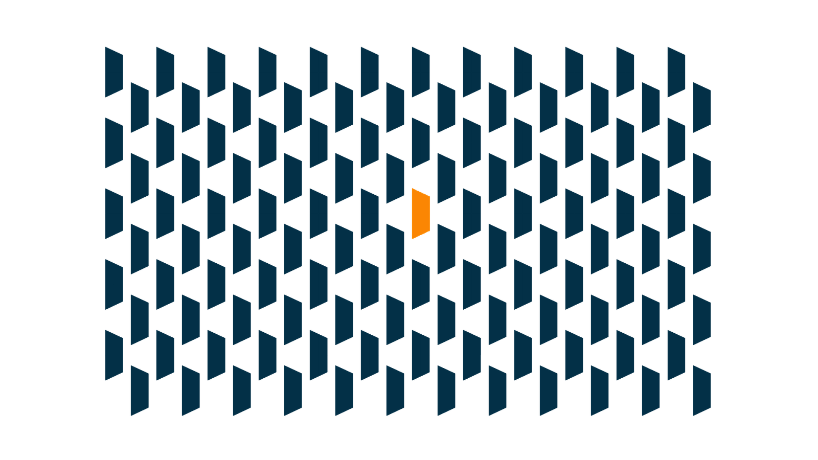
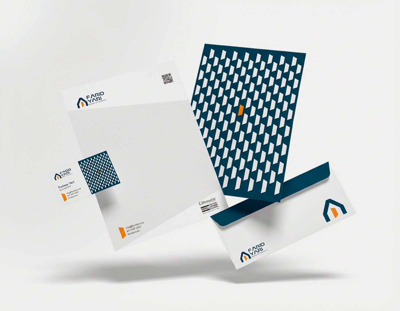
Visual Texture & Pattern
Farid Yari’s visual pattern is designed as a structural layer within the brand identity rather than a purely decorative element.
It is derived from simple, repeating geometric forms inspired by the logo’s architecture, reinforcing a sense of order, continuity, and cohesion.
The pattern’s consistent rhythm reflects stability and thoughtful planning throughout the real estate journey, while controlled spacing and repetition prevent visual clutter or overload.
This balance ensures the pattern remains professional, trustworthy, and easy to read.
Applied purposefully across brand materials such as backgrounds, stationery, printed assets, and digital surfaces, the pattern supports visual consistency without drawing excessive attention.
Within the system, the pattern acts as a supporting element:
strengthening the identity without competing with the core message.
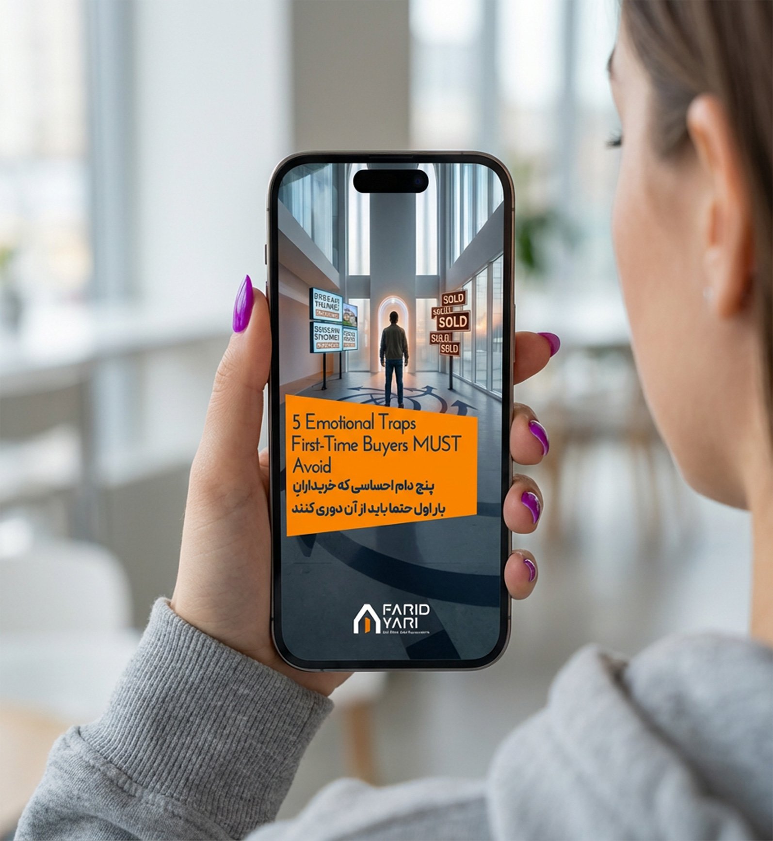
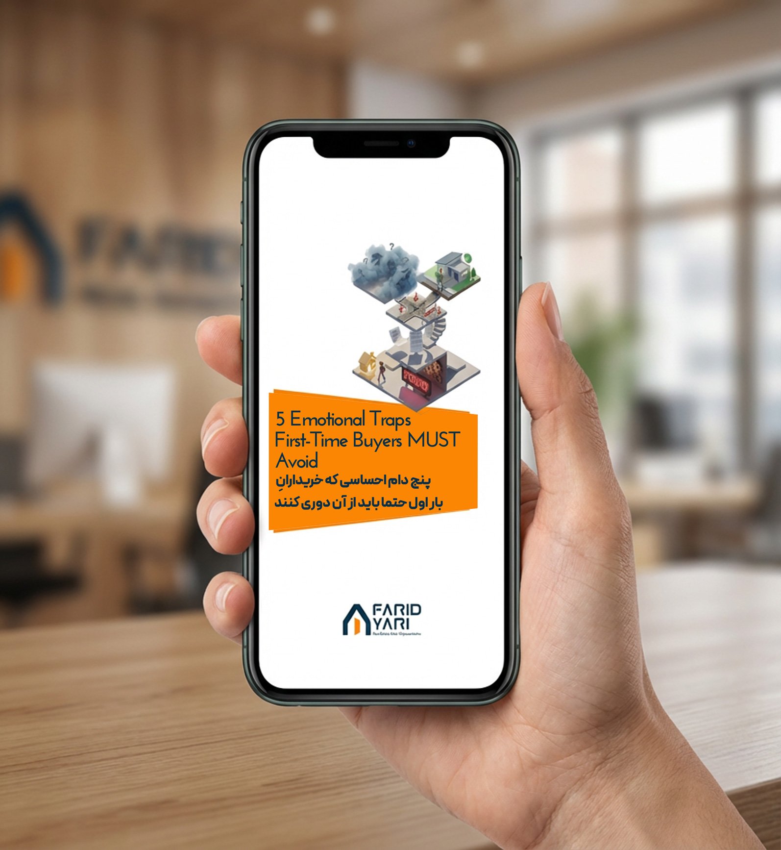
Social Media Visual Identity
The visual identity designed for social media is one of the brand’s most important customer touchpoints.
In this project, posts, stories, and promotional content were designed to ensure instant brand recognition, convey warmth and trust, and create a cohesive digital brand experience.
This visual system turns every online interaction into an opportunity to strengthen brand perception and long-term memorability.
a
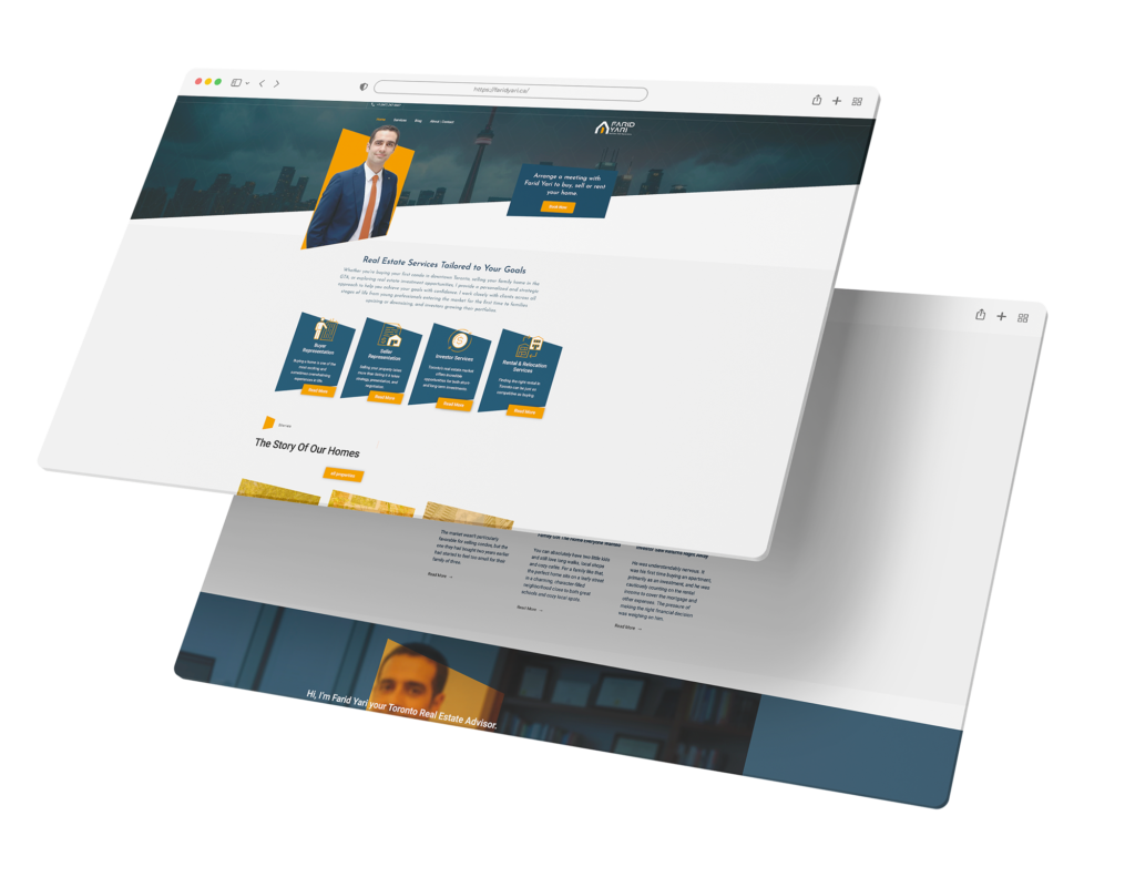
A Cohesive Visual Identity for a Clear Digital Experience
This website is designed around a cohesive and intentional visual identity, creating a clear, trustworthy, and seamless user experience.
From page structure to color choices and graphic details, every element works together to communicate professionalism, stability, and clarity throughout the real estate journey.
The goal is to support confident decision-making by presenting information in a structured, calm, and accessible way across all digital touchpoints.