Sherry’s Catring
Project Overview
This project was developed to shape the brand identity of Sherry’s Catering around the personality and values of its founder, Shohreh Marhamat. Shohreh’s warm, approachable, and trustworthy character plays a central role in how the brand is experienced. By translating these traits into a clear brand archetype, we built a cohesive visual and strategic system that communicates homemade warmth while reinforcing professionalism, quality, and reliability across all touchpoints.
-
Partners
Bahram Rameh, ,Behnam Rad , Negin Moghaddar Doust
-
Client
Shohreh Marhamat
-
Published
2025
1. Brand Essence & Philosophy
In defining the core of this brand, we identified a powerful blend of three archetypes: the Everyman , the Lover , and the Ruler. Our goal was to steer away from an “industrial” or “distant” corporate image. Instead, we crafted an identity where the audience can instantly sense the warmth of a shared meal (Everyman), the passion poured into cooking (Lover), and the assurance of high-level quality and hygiene standards (Ruler).
In defining the core of this brand, we identified a powerful blend of three archetypes: the Everyman , the Lover , and the Ruler. Our goal was to steer away from an “industrial” or “distant” corporate image. Instead, we crafted an identity where the audience can instantly sense the warmth of a shared meal (Everyman), the passion poured into cooking (Lover), and the assurance of high-level quality and hygiene standards (Ruler).


2. The Design Path: A Familiar Face
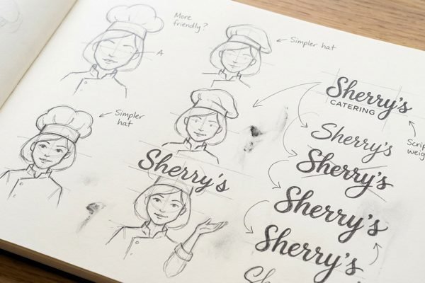
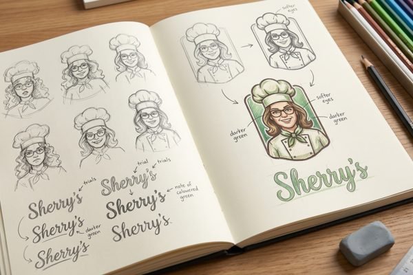
To establish maximum trust and transparency, we adopted a Character-Based (Mascot) Strategy.
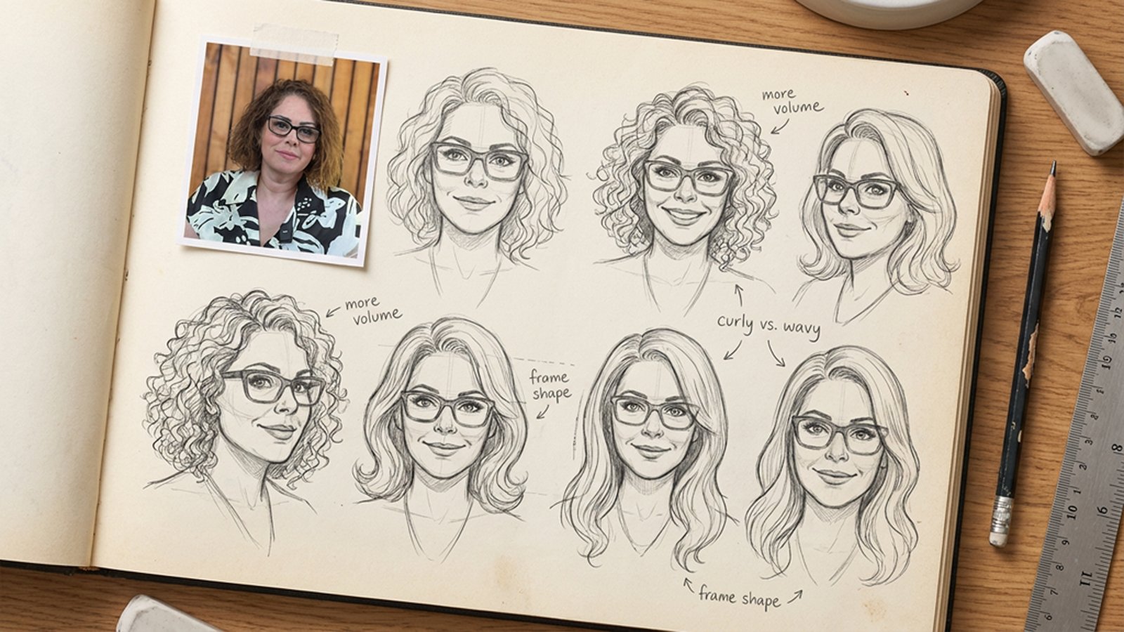
Why a Character? In the culinary world, nothing guarantees quality quite like the chef’s own signature. We illustrated the founder, Shohreh, to put a personal stamp on every dish.
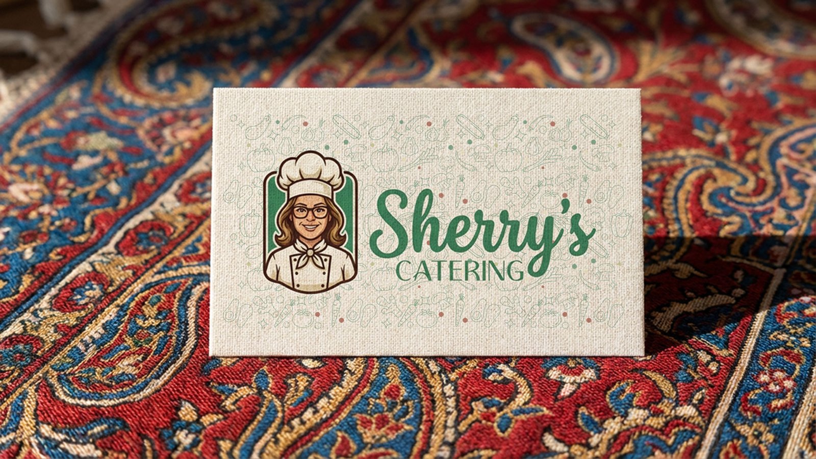
The Vibe: The character’s smile and glasses convey kindness, intelligence, and precision. The chef’s hat signals professional expertise. The Sherry’s typography is designed in a script style to evoke fluidity, comfort, and a personal touch.
3. Logo System: A Responsive Framework
To ensure legibility and functionality across all brand touchpoints, we developed a responsive logo system with three distinct variations:
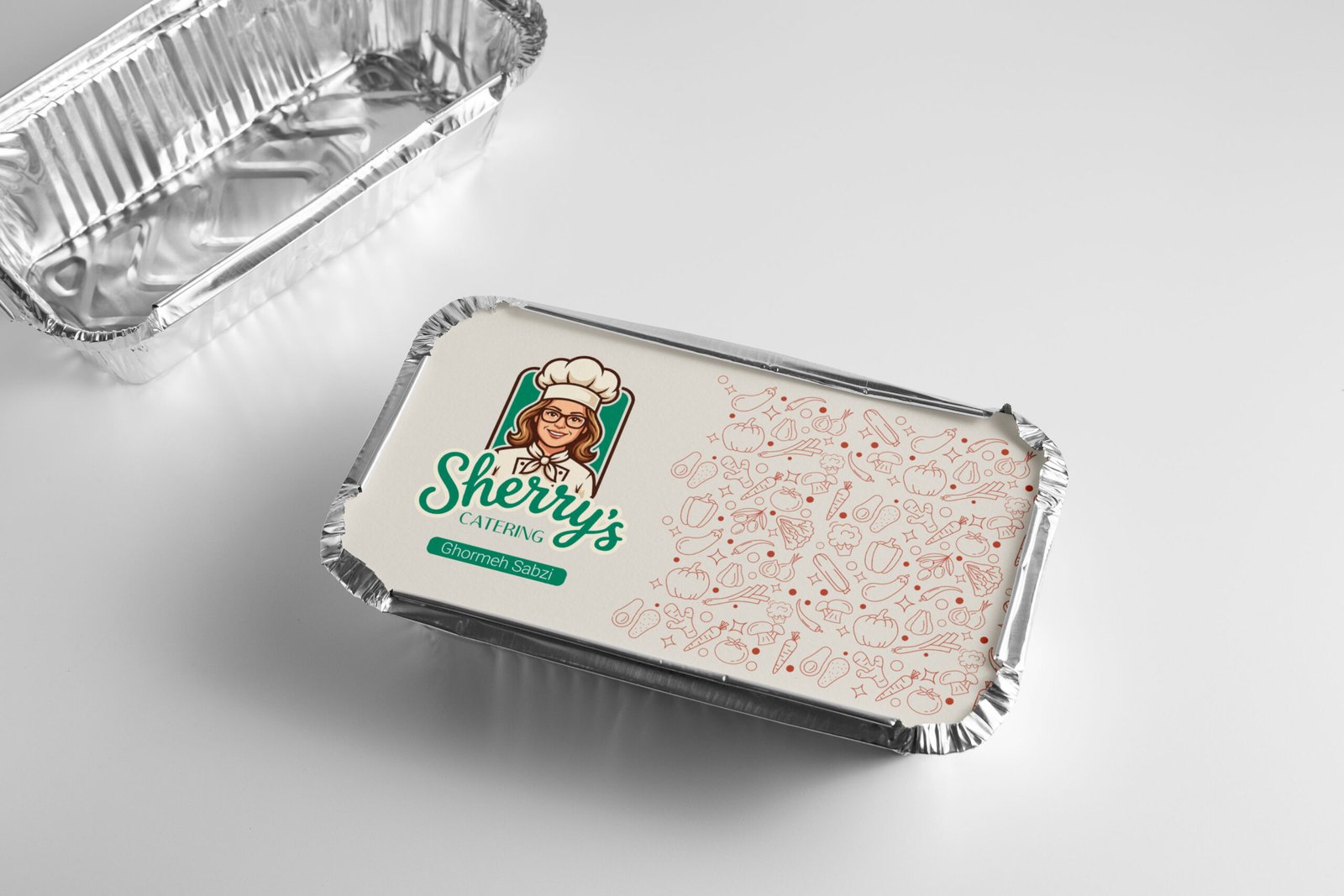
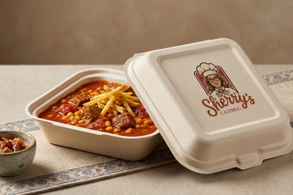
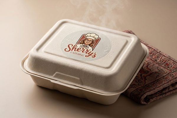
Primary Vertical Stack: The main badge of the brand, featuring the character centrally. Ideal for packaging labels and social media avatars.
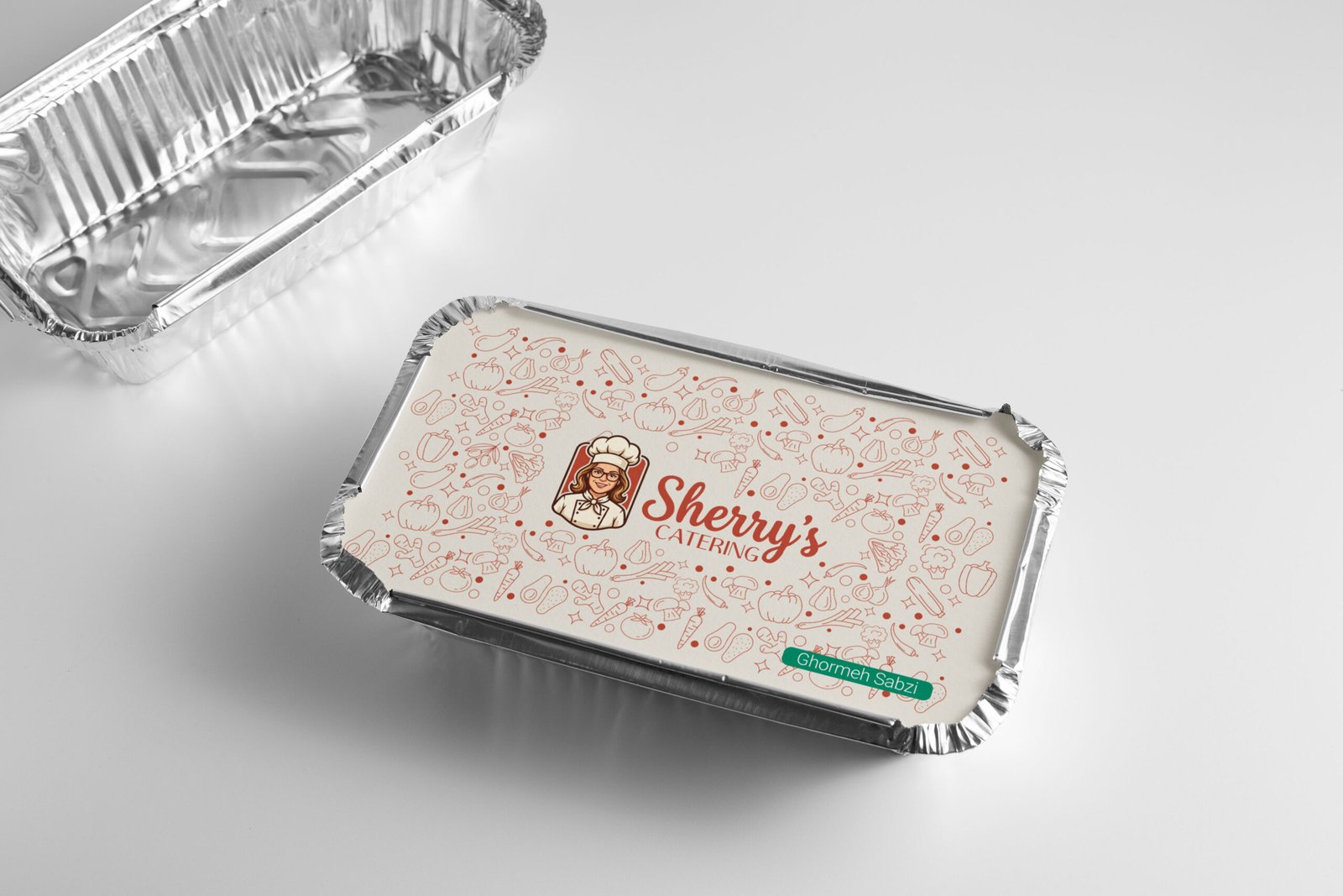
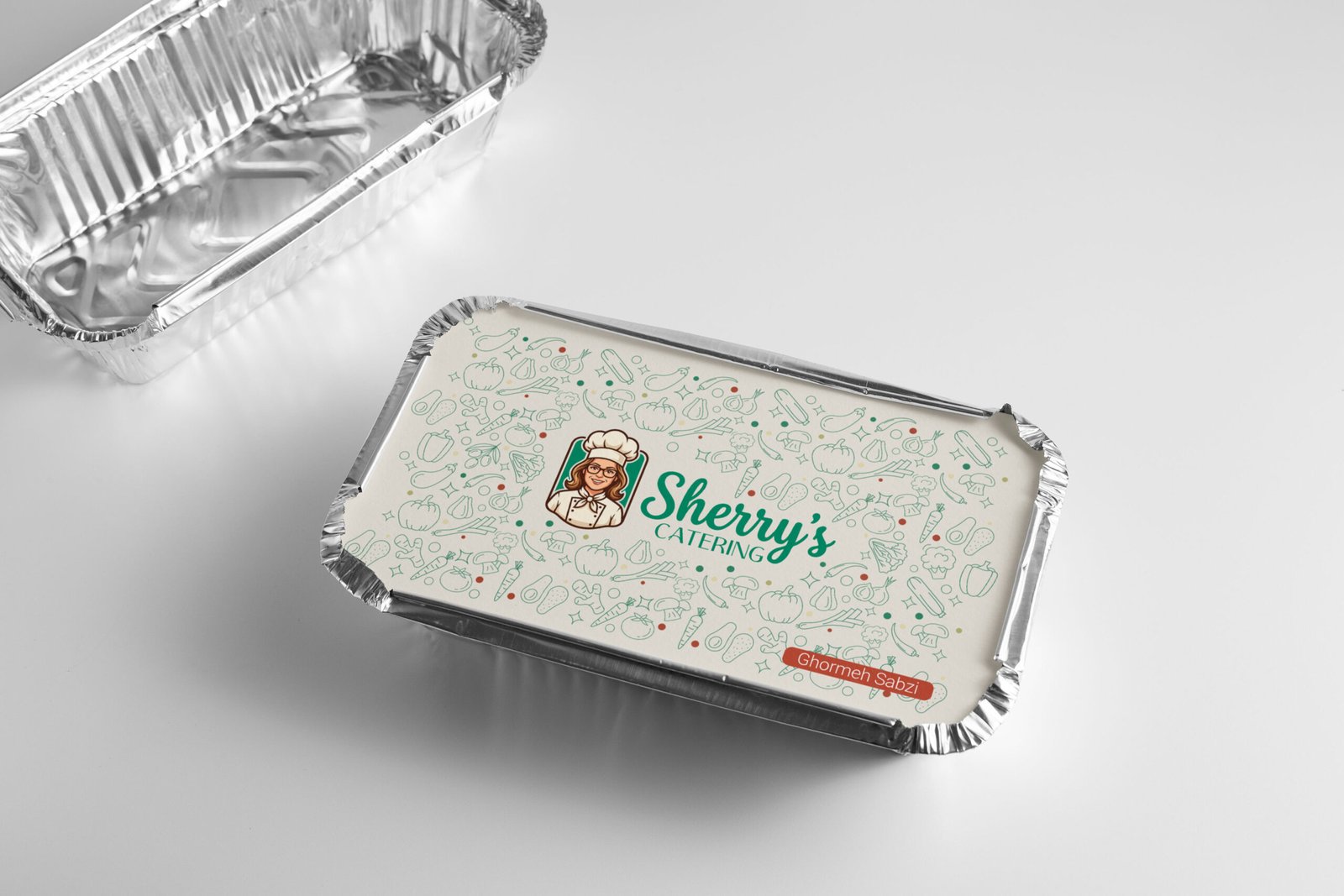
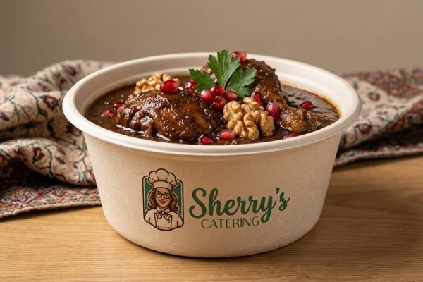
Horizontal Layout: Designed for spaces with vertical constraints (like website headers or stationery), placing the typography beside the character to maintain visual balance.
Monochrome Line Art: A stripped-back, single-color outline version. This is essential for restricted printing techniques such as rubber stamps, thermal receipts, or embossing, where full color is not an option.


4. Color Palette & Mood: A Recipe of Tones
Our palette is carefully curated to trigger appetite and evoke comfort, moving away from artificial colors to an organic, earthy selection:
Terracotta & Sage: The primary duo. The reddish-brown (Terracotta) represents the heat of the oven and authentic spices, while the muted green (Sage) symbolizes fresh herbs and healthy ingredients.
Butter & Dough (Neutrals): Instead of using a single flat white, we utilized a gradient of warm neutrals—ranging from Vanilla to Wheat. These shades mimic the color of fresh dough and bread, reinforcing the “homemade” promise.
Charcoal Black: Used for text and outlines to add modern contrast and professional solidity (The Ruler archetype) without being overpowering.






5. Visual Texture & Pattern: The Art of Ingredients
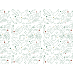
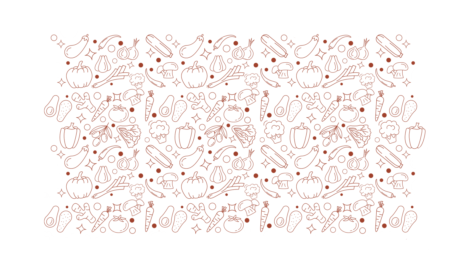
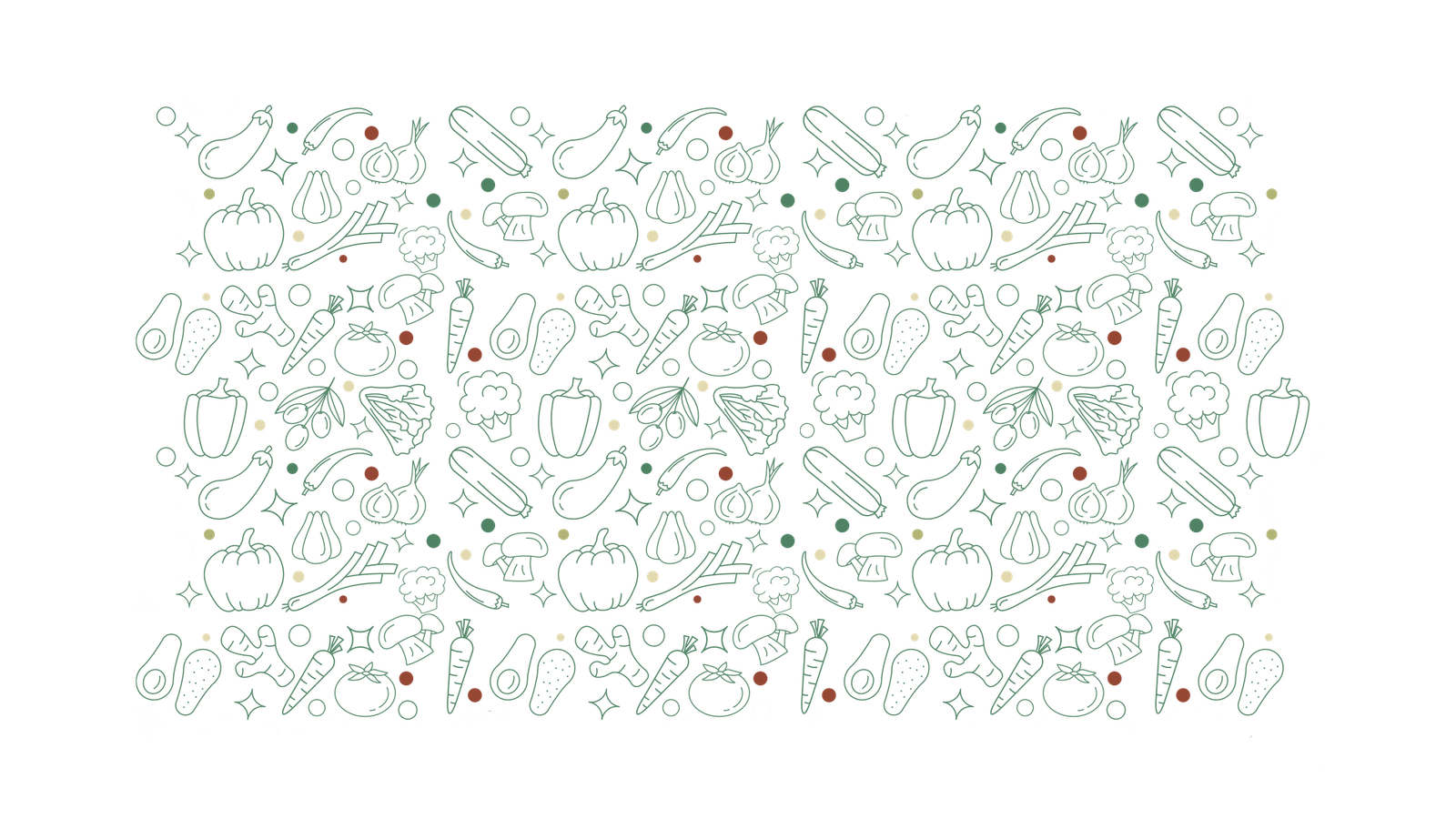
To ensure visual consistency across all brand touchpoints, we crafted a custom pattern inspired by the kitchen’s raw ingredients.
Linear Illustrations: The delicate line-art drawings of peppers, carrots, mushrooms, and onions convey a sense of “lightness” and “health”.
Versatile Application: Designed in our signature colors (Terracotta for energy and Sage for freshness), this pattern serves as a cohesive background texture throughout the visual identity, adding professional depth without creating visual clutter.




Social Media Visual Identity
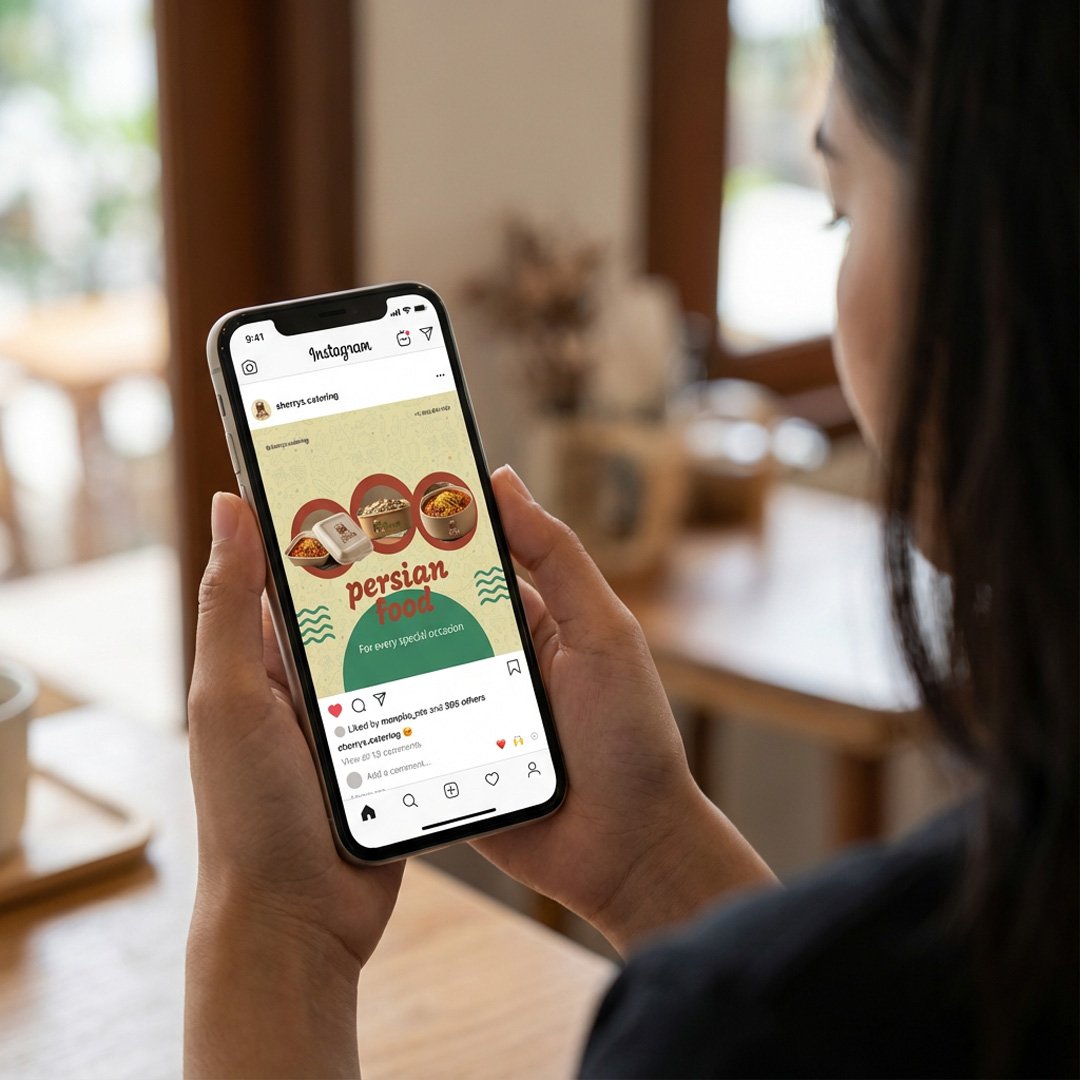
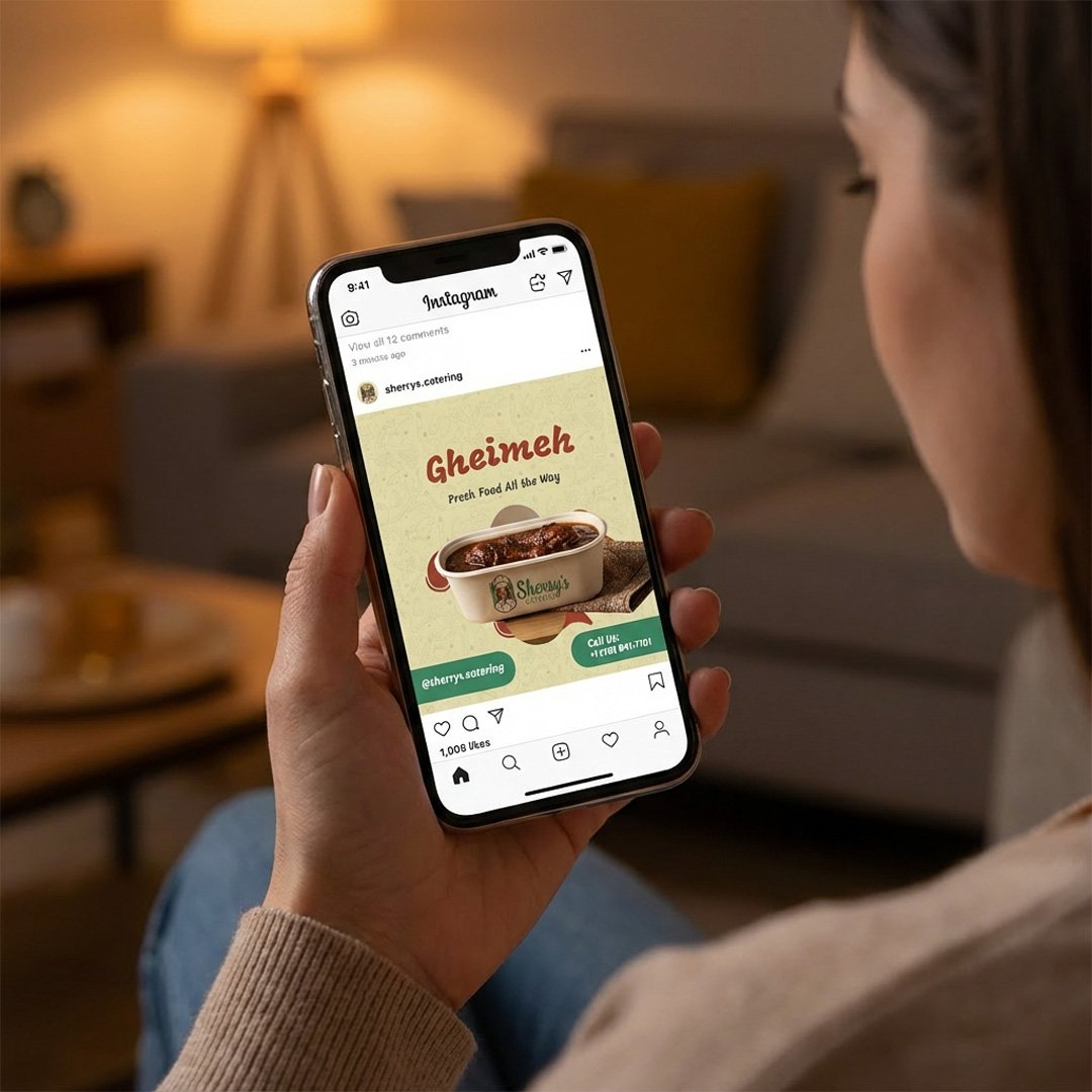
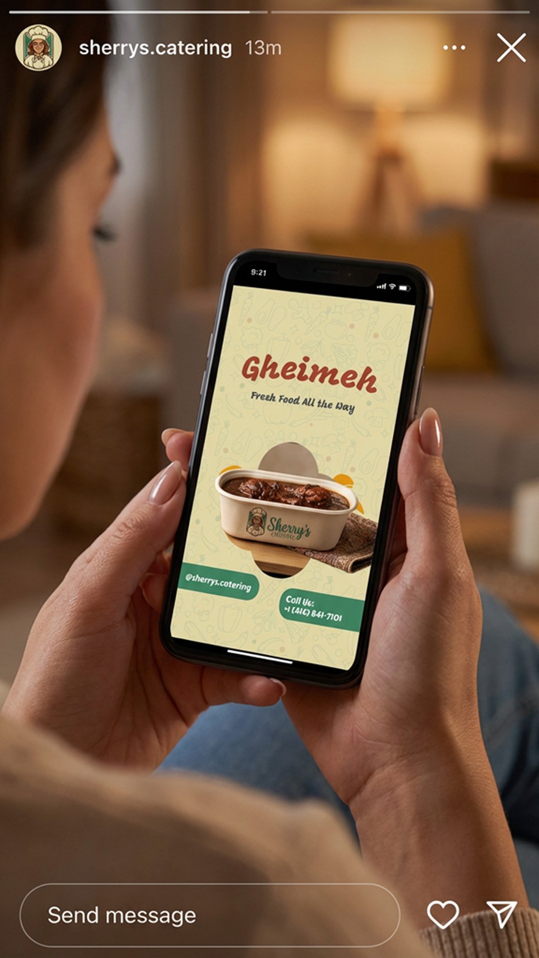
The visual identity designed for social media is one of the brand’s most important customer touchpoints.
In this project, posts, stories, and promotional content were designed to ensure instant brand recognition, convey warmth and trust, and create a cohesive digital brand experience.
This visual system turns every online interaction into an opportunity to strengthen brand perception and long-term memorability.
